Tarmac
Blue Circle,
Helping build the UK
Force24 | UX, UI, Web Design
Rebuilding the builder
Blue Circle, a Tarmac company, is the UK's largest materials suppler and needed a new home.
Not just a coat of paint
but a new rewiring
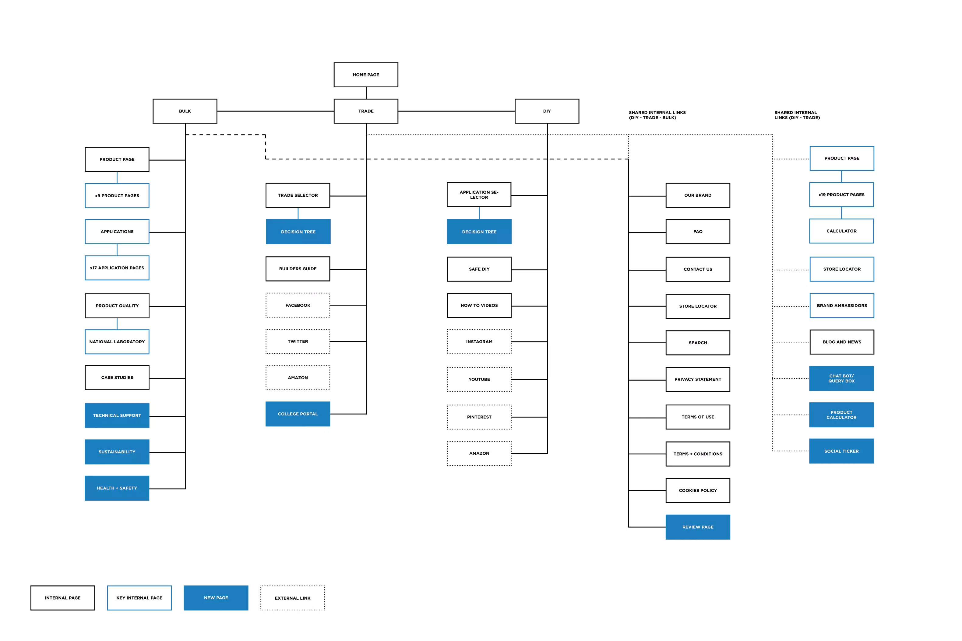
The first step whilst reviewing the Blue Circle website was that the site map and navigation structure were not well optimised - to the extent that some pages were duplicated, had missing links and some which were hidden away in sub menus. To get things started we did a complete review of the site, and started to compile pages, add new key pages and trimmed the fat.
Entry is free
Finding your way
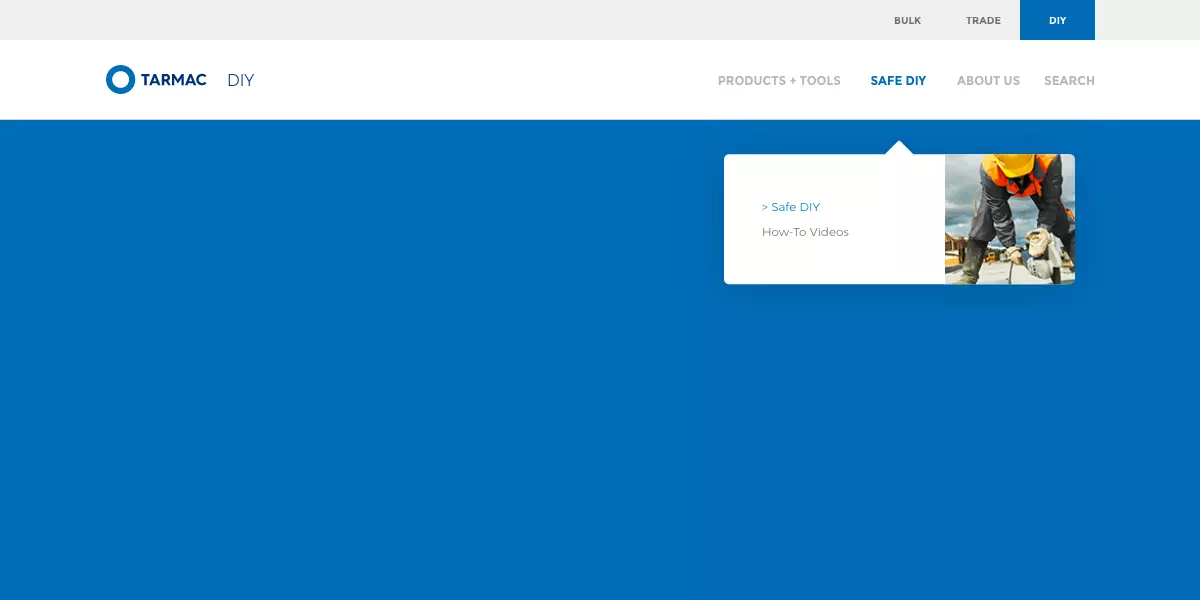
The main entry way into the website was through a three link filtering system. This filtering system broke the content of the site down into it's three key demographics, tailoring the experience for each user.
This was a feature that we brought through to the new site as it allowed the tone of voice to adapt depending on the users experience level. Furtermore it reccomending products, information pages and articles that would be the more appropriate. This was a simple but effective way of giving users the best experience as Tarmac doesn't utilise a split-test system, using customer data.
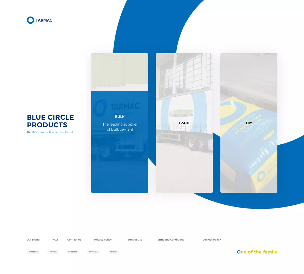
Existing Entry Page
Keeping it flexible
across the whole site
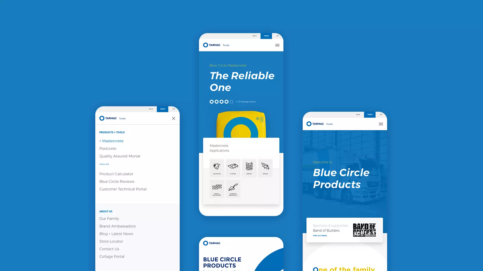
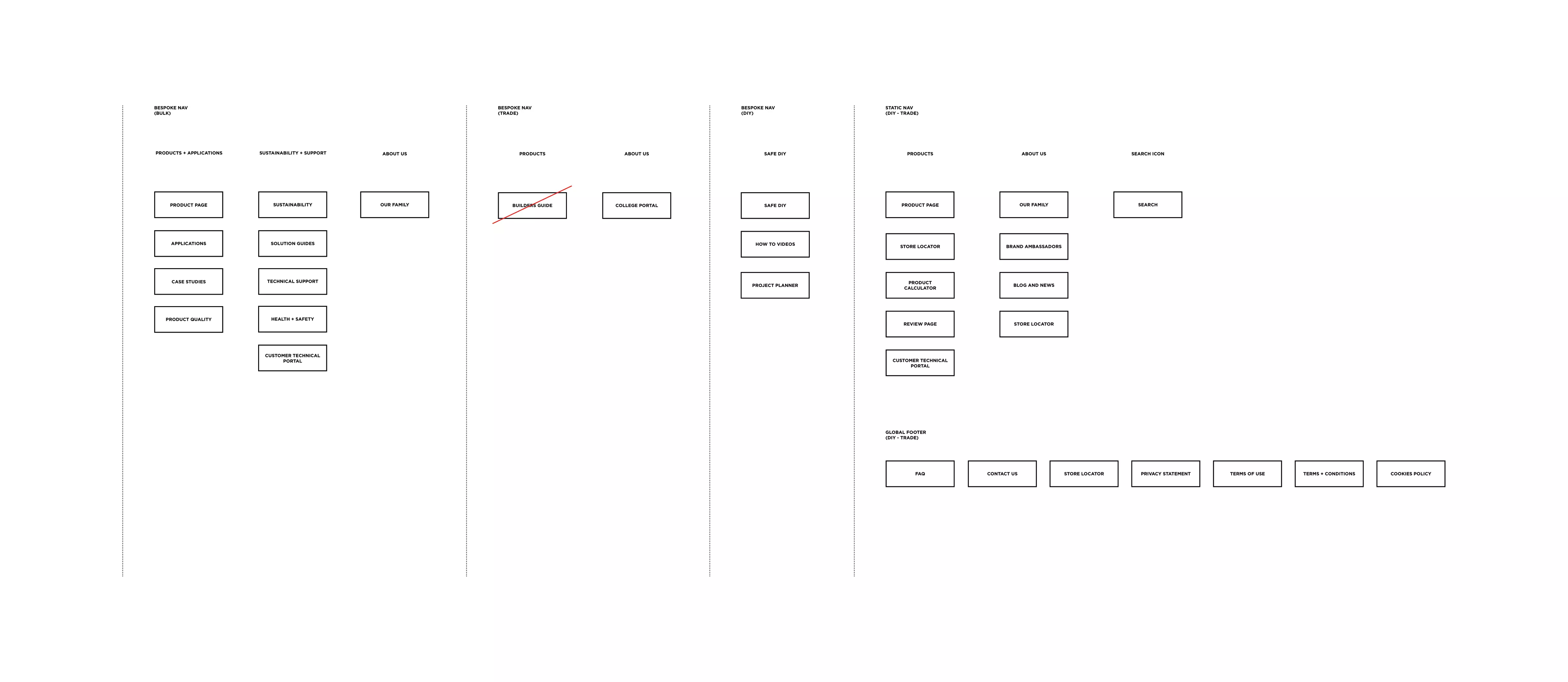
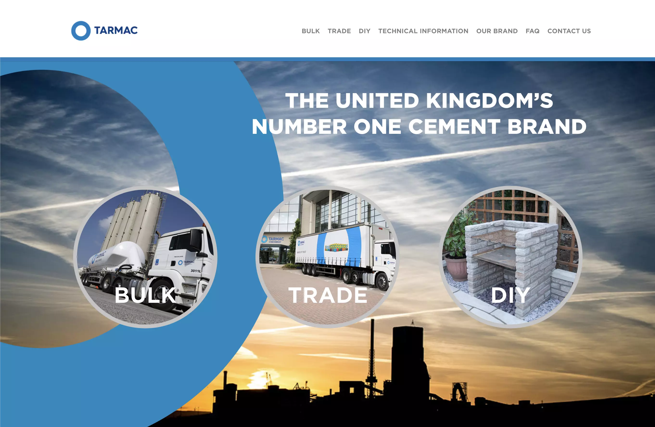
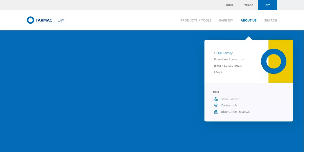
One of the first issues we found when resarching the UX of the UI was that once customers selected a business sector, they could not return back. This became a issue with users that tread the line of two disiplines. To maximise information available and allow users easier site navigation, we introduced a new navigation bar to allow inter-disciplinary browsing.
A New Navigation
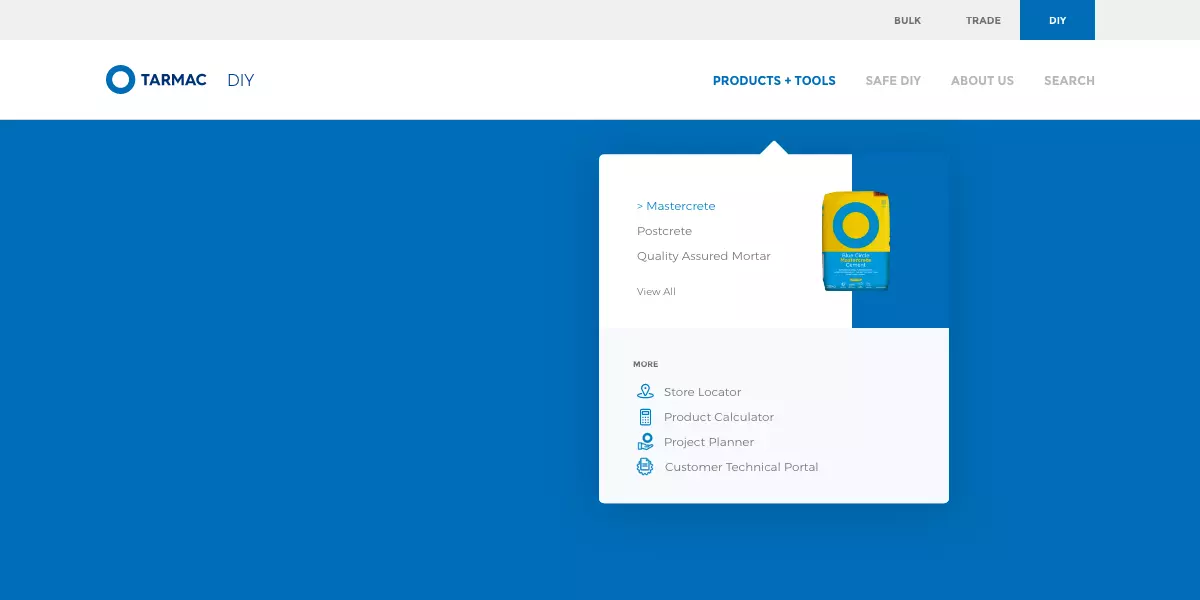
Slim down, bulk up
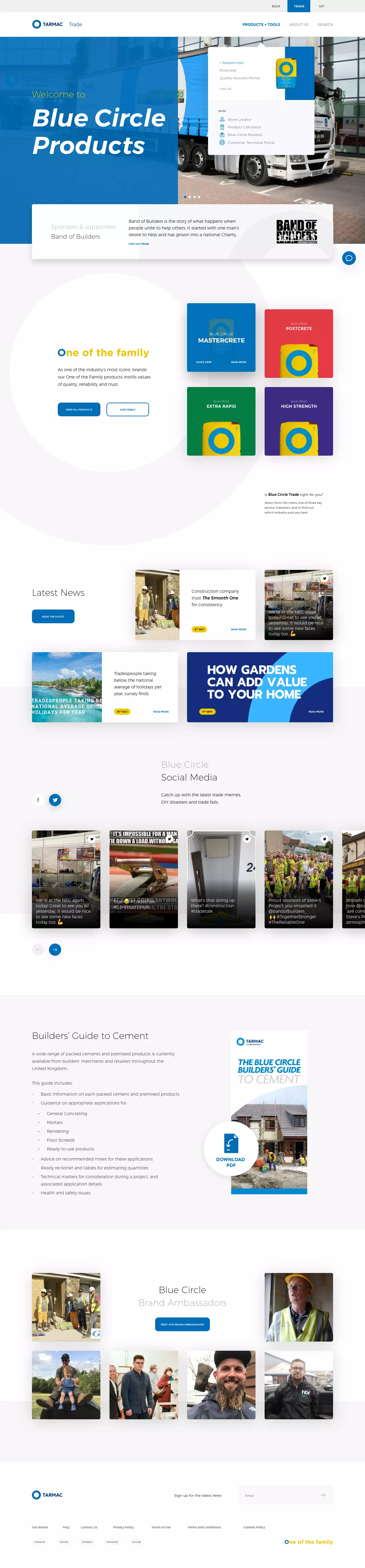
Looking at the previous site, the navigation was quite bulky, and was made to display everthing in the drop down menus, or had dedicated links to individual pages. So to alleviate listing all the pages we inlcuded "view more" options, as well as introducing new dedicated listing pages.
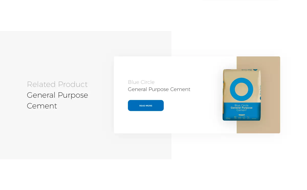
With all this new space, we began to reassign the pages into categories, rather that having a dedicated "products" menu, we highlighted related product pages, cutting down the origional seven links by half.
Cater for everything
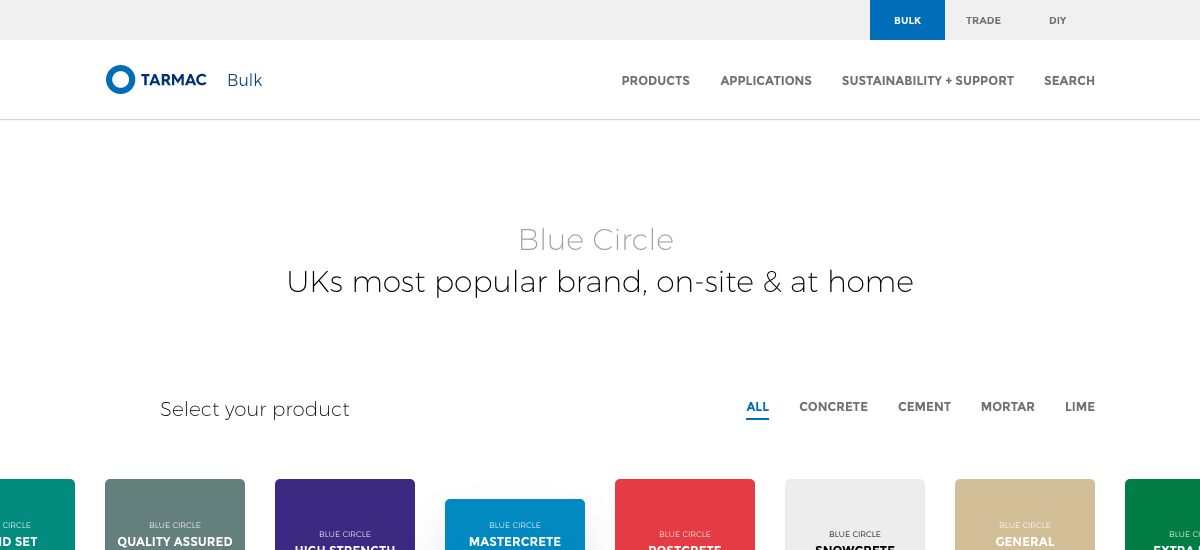
Bulk to DIY
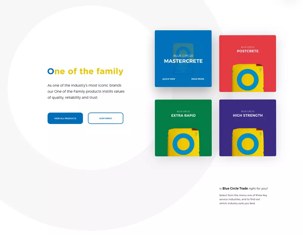
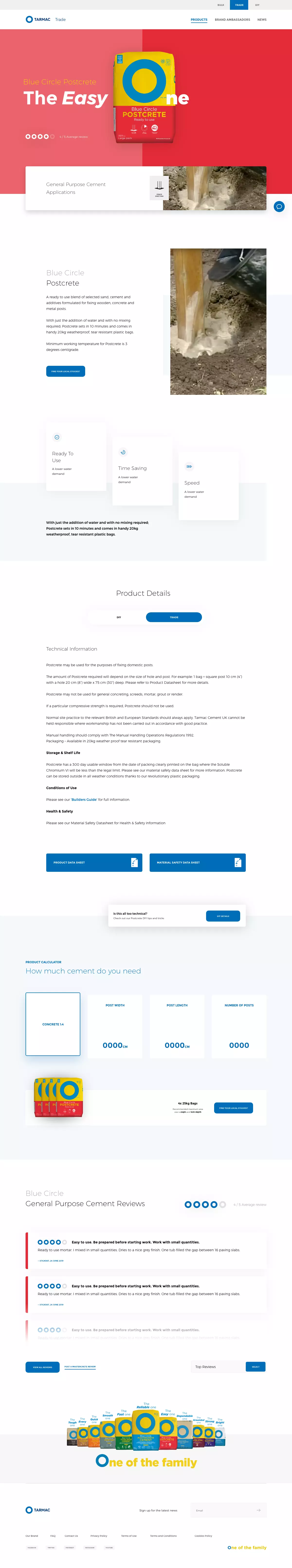
When we began to review the three home pages for each sector, we wanted to showcase how Blue Circle products cater for a wide audience.
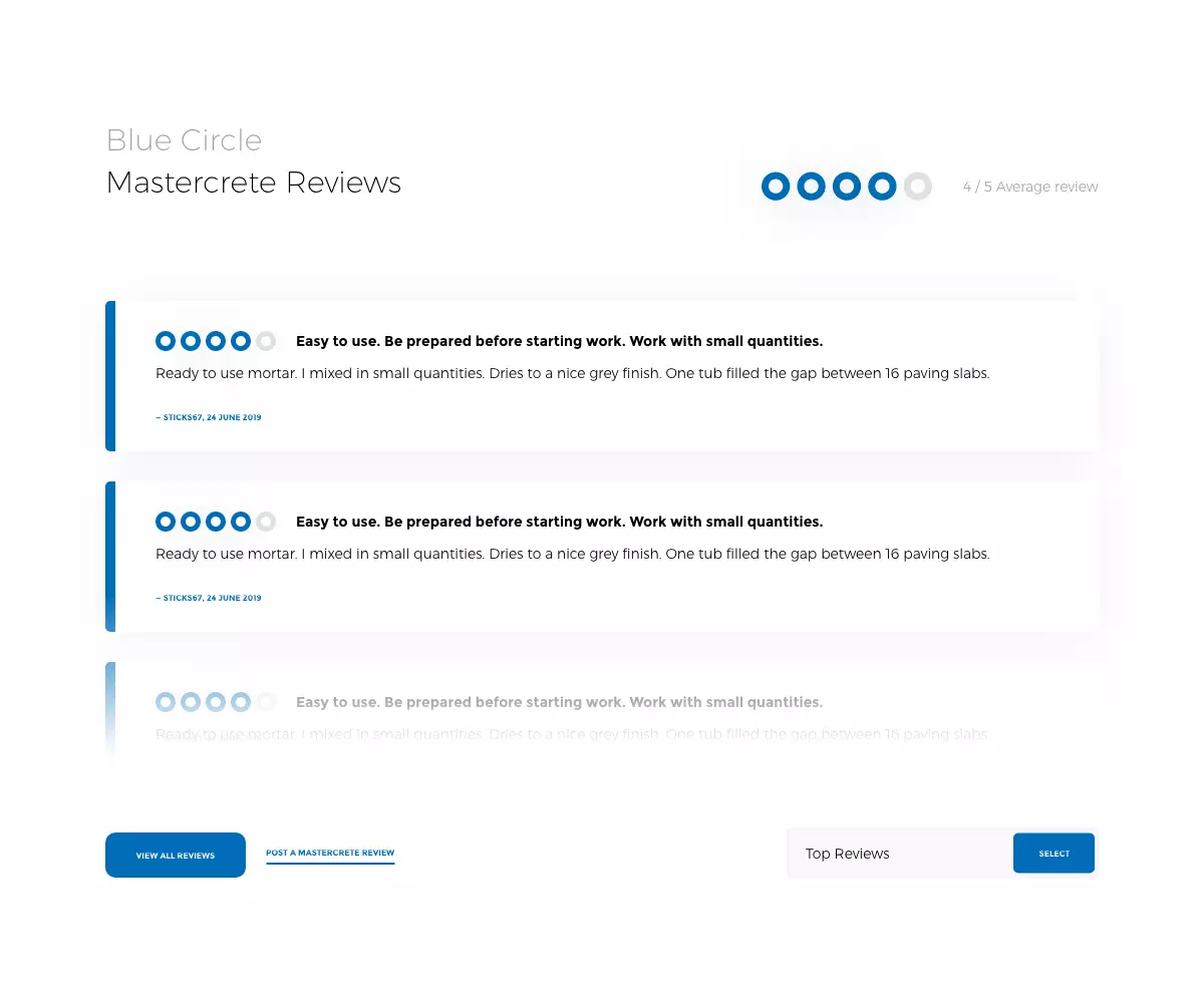
Typically consumers would relate the brand to the more common "bulk" side of the industry so firstly, we needed to elevate the Blue Circle bagged products. Secondly, we needed elevate the DIY culture which was, up until now, underserviced. By adding in new dynamic sections to the homepages, we could keep the homepage up to date with the latest news and showcase customer sucess stories.
Design System
The bricks and mortar
The new dynamic sections of the site were a new addition. To make the most of these bespoke assets, they were designed to adhear to a new design system that would make the construction of new content through the CMS. This automation not only saved time but maintained the aesthetic, making the whole process more future-proof.
Product highlght
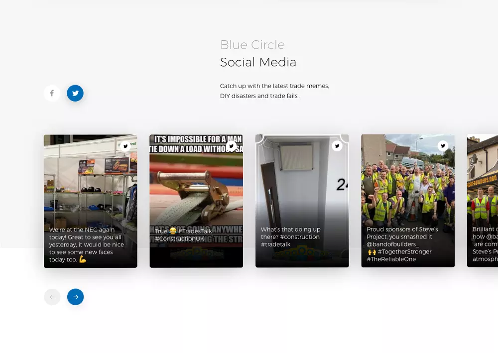
Social Media carrousel
Customer showcase
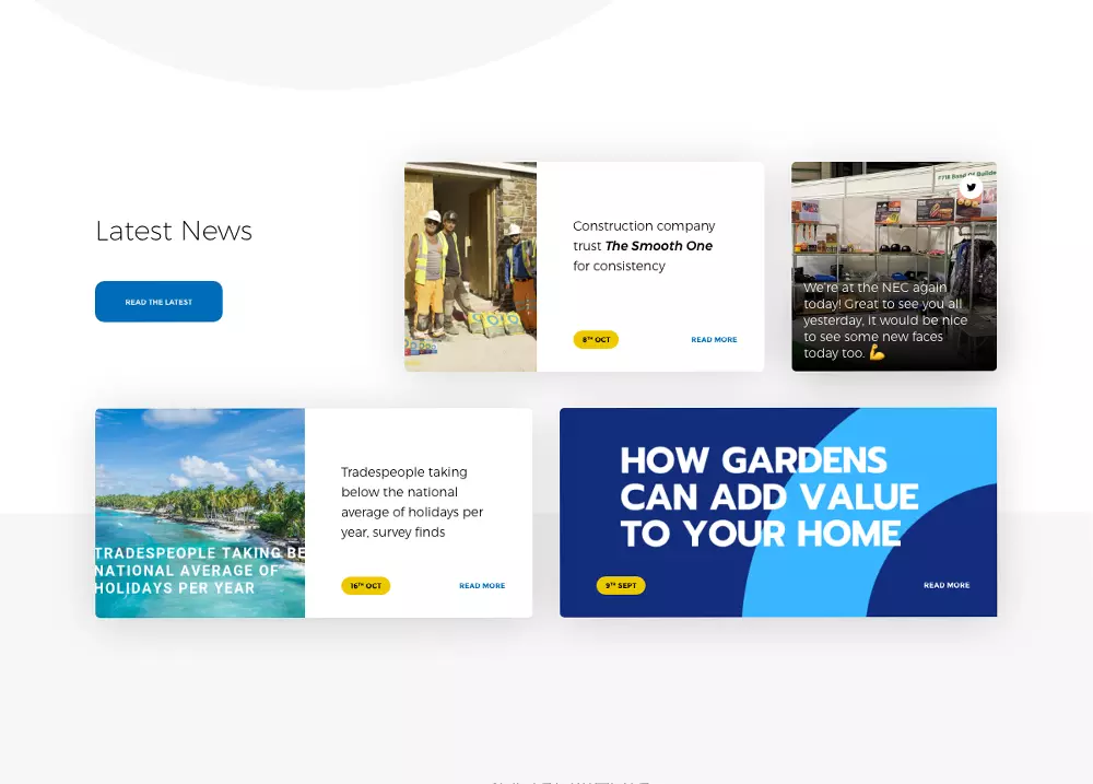
Latest News
Product, Products
Who's got the Products?
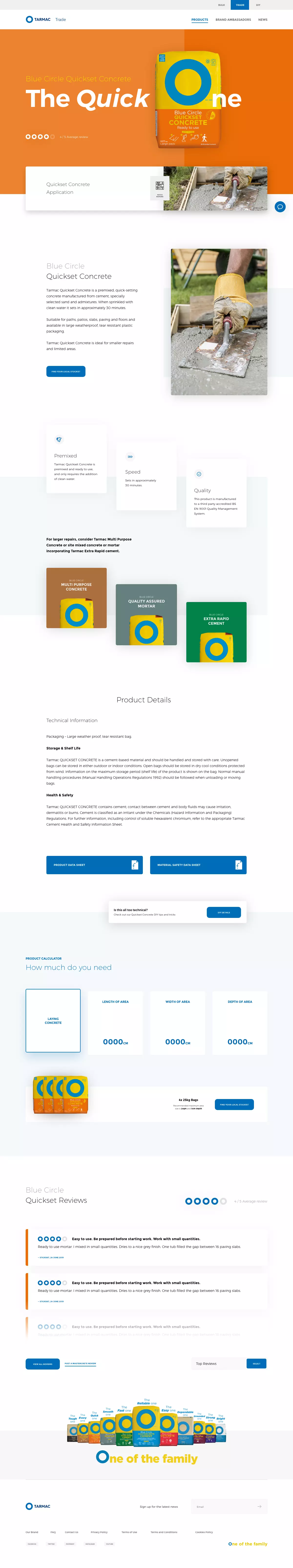
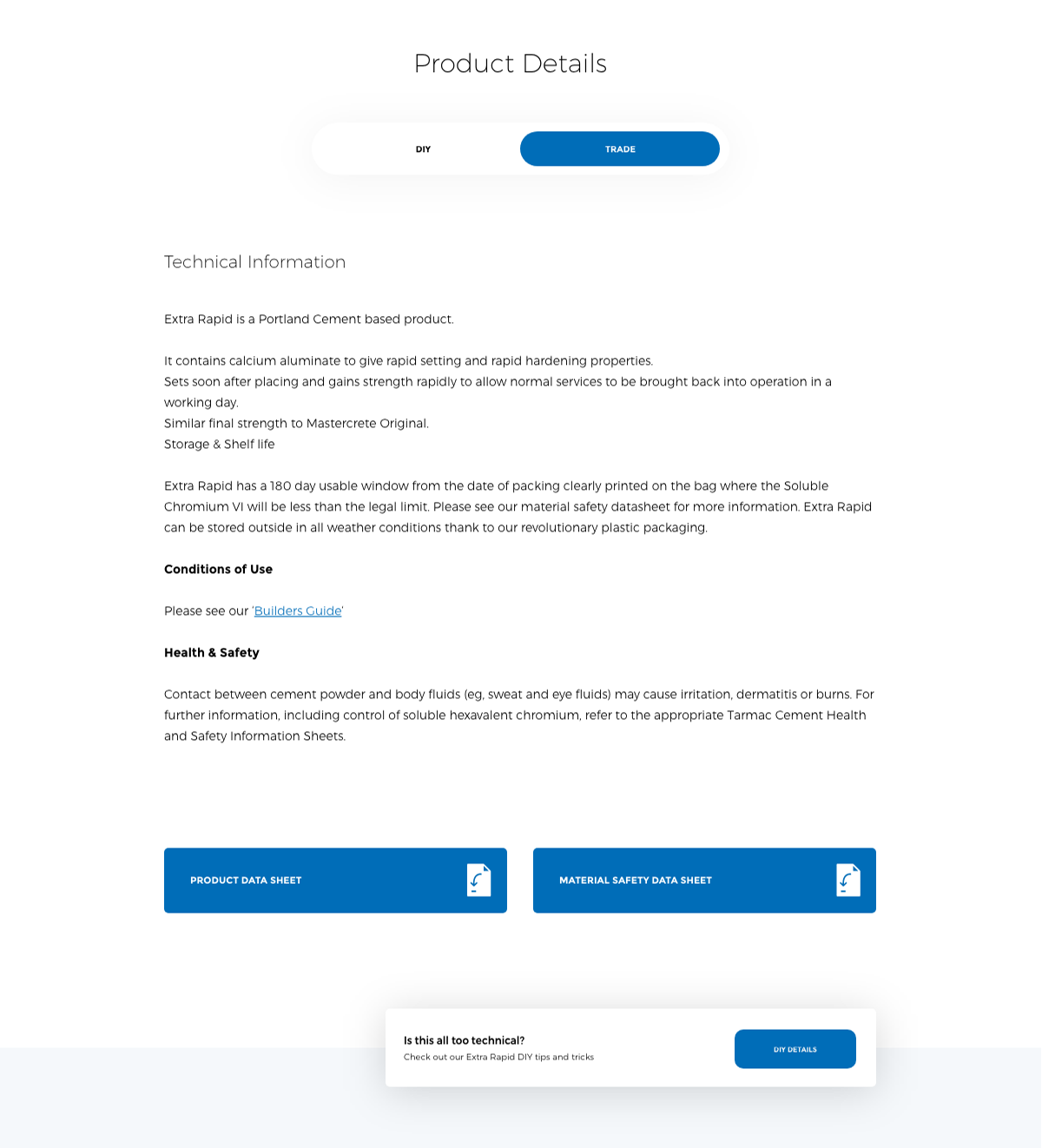
As the exisiting product page content was robust and comprehensive, we only looked to improve the journey through the page. By making the content work harder and giving each piece it's own space, the little detials became as important to the products characteristcs as the technical information.
Best of Both World
DIY and Trade
As previosly mentioned, the DIY and Trade sectors were designed to be bespoke, but this resulted in duplicate pages for every product yet, some information wasn't availabe on both versions. Aditionally this doubled the number of pages to be serviced.
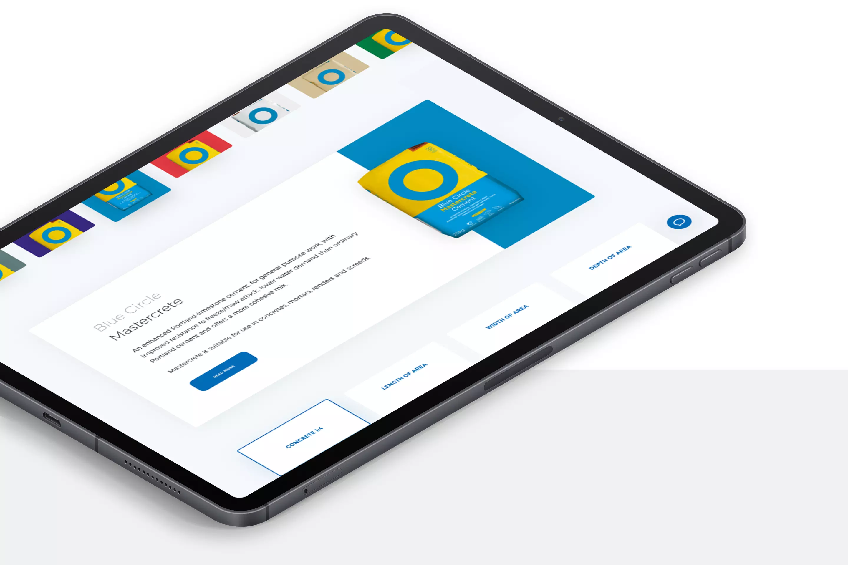
To make things more streamlined we now have one page per product, but have dynamic product details which would be pre-selected depending on the overarching sector, which could be switched, making all information easily accessible for all users.
Quick, clear
and practical
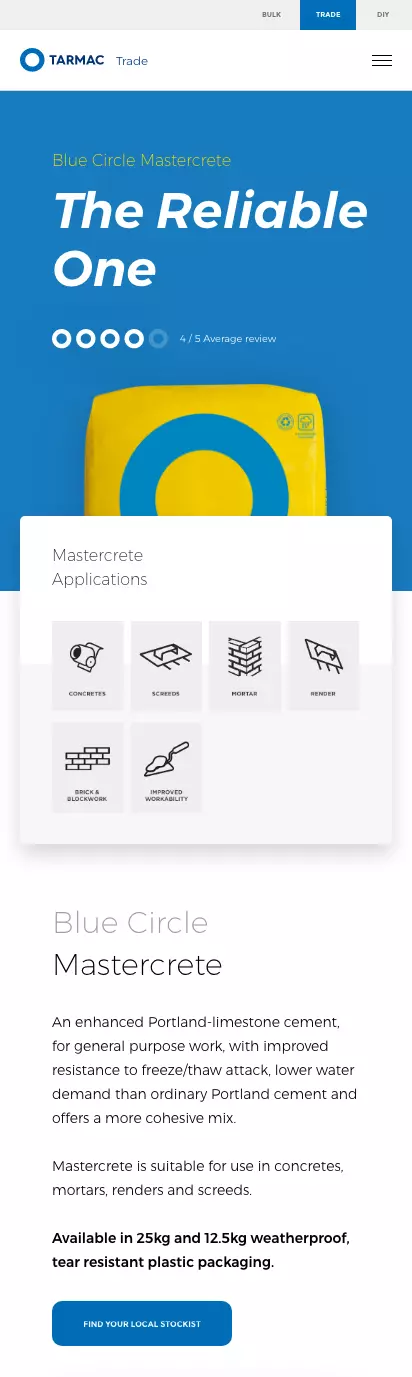
A new set of icons helps Blue Cirlce users quickly understand where they are and what it’s all about.
Blue Circle Products
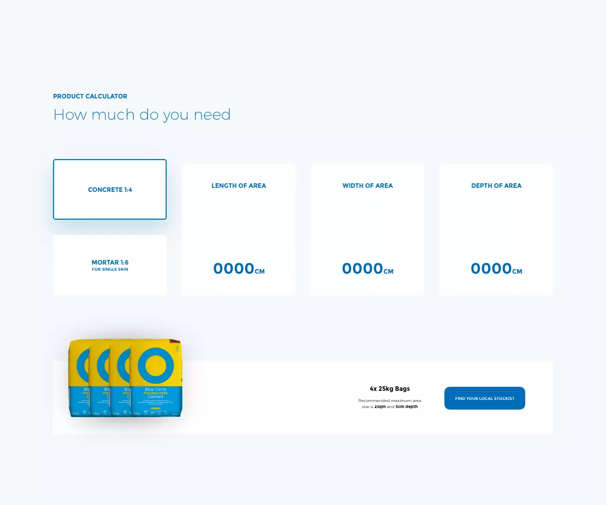
Designed to help you
Some of the content that we really wanted to push really deserved an upgrade, as these could be found on most of the product pages, we found they were massively under-utilised. So, as with other aspects of the pages, we gave the artwork a new coat of paint and gave them more real estate on the page to stand out more.
Lots of jobs?
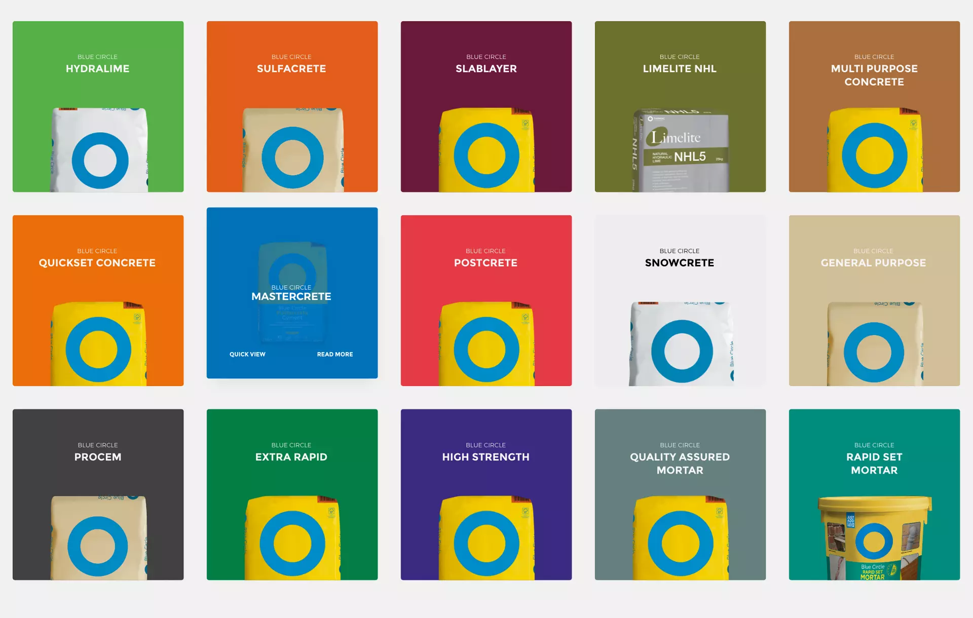
There's a bag for that
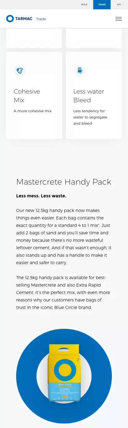
With 16 individule products producted by Blue Circle, it was important to create modular product icons which could adapt depending on their use. Designing a responsive product module allows better continuity of the design system, which makes building new pages quick and easy.
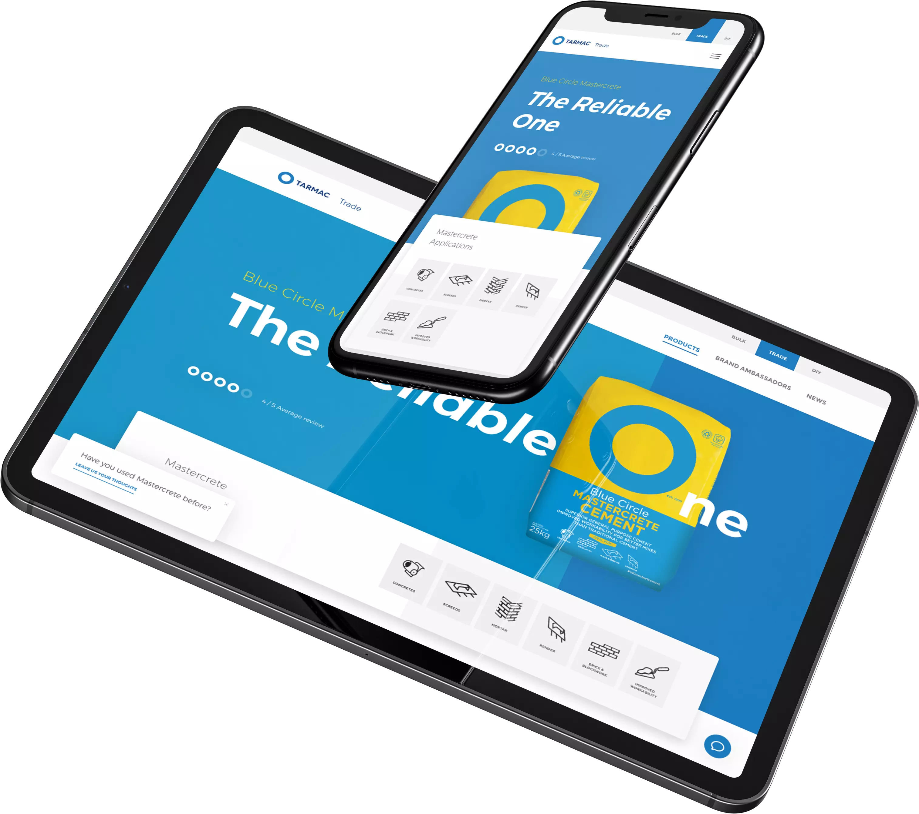
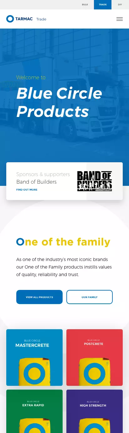
Mobile Friendly
To retain creative integrity across devices, we also designed the experience specifically for mobile. Smooth interactions and animations from the desktop continue to interact with the user through scrolling and swiping on the phone.